Uplifting Brands That Uplift Others

hello@upandup.agency
504 Rhett Street, Suite 100
Greenville, SC 29601
(864) 373-9330


hello@upandup.agency
504 Rhett Street, Suite 100
Greenville, SC 29601
(864) 373-9330


 creative design | higher education
Imagine you’re a high school senior trying to pick a major. You could spread a massive pile of brochures on your bed and start flipping through them. Or you could download a 152-page PDF and start the never-ending scroll of death. Or, you could start with “I like to help others” or “I want to be an architect.” Which sounds like a better experience? We thought so too.
In the world of user experience, think Thoreau and “simplify, simplify.” That was our goal with the University of Kentucky’s admissions site. Since so many high school seniors are undecided, we set out to make it easy and fun for them to make a “major decision.” And in higher education marketing, making that choice easier is one more way to make your prospective students choose you over your competitors.
So we went from this:
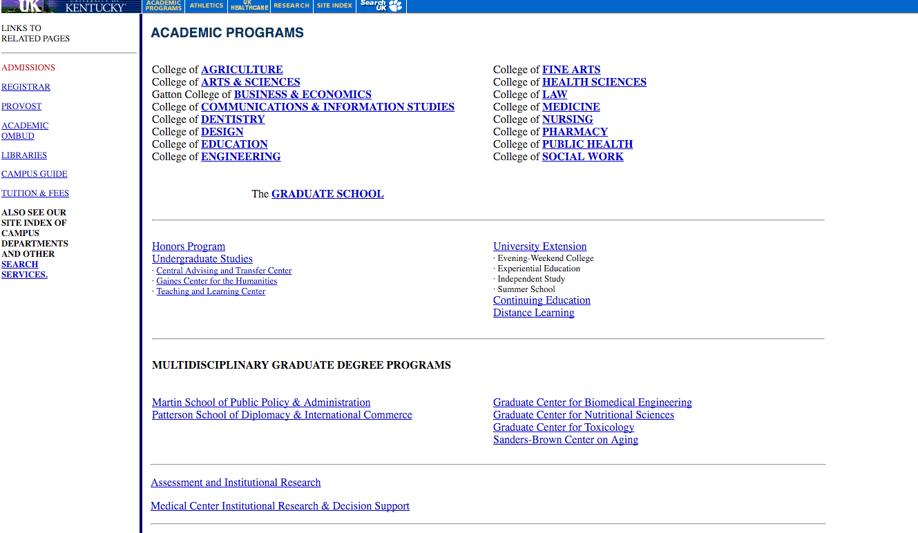
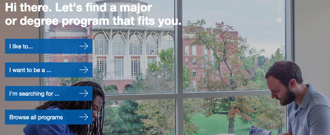
Unless you’re the kind of person that enjoys faxing things and still uses a word processor, you probably prefer the second option. You’d rather go through a clean & simple process than a messy and unwieldy one.
This project is having a bigger impact than we ever could have imagined. What started as a design project has grown to affect their culture in many ways—advisors are taking a different approach to advising, and departments are taking ownership and pride in their web content.
So what are some high-level tips for creating a simple & enjoyable user experience?
Great design begins with the user. In the case of UK, thinking like a high school student led to a set of questions & prompts, which led to a way to simplify major choice. When you get away from how it’s “always been done,” you may open the door to a simplified user experience, one that makes your higher education marketing efforts worth it. Would you rather choose the college that simplified a process or made it convoluted?
When you strip away the clutter of a convoluted user experience, you present a clear path. Keeping it simple is always a good thing. However, I said “usually,” since in the case of UK, we created multiple “right ways” for the user to choose a major. There are sometimes benefits to offering more than one right way, as long as the path is still clear.
What complex user experience problems have you solved? How did you plan the way to solve them? How has that impacted your higher ed marketing efforts? Share your experience in the comments.
client story, creative design, higher education, higher education website design, web development
digital marketing, digital media, digital strategy for higher ed, higher education, higher education brand strategy, higher education website design, web development