Uplifting Brands That Uplift Others

hello@upandup.agency
504 Rhett Street, Suite 100
Greenville, SC 29601
(864) 373-9330


hello@upandup.agency
504 Rhett Street, Suite 100
Greenville, SC 29601
(864) 373-9330


 higher education website design | web development
It’s easy to think about a layout on the web as being a primarily visual concern. The header goes up top, the sidebar is over here, the call to action is in an overlay on top of the content (just kidding). Grids, borders, spacing and color all portray valuable visual data, but if these hints to the structure of a page are only visible, some users may find your content unintelligible.
You can experience this first hand if you try using a screen reader on the web. When I fired up VoiceOver on my Mac and took it out for a test drive, I realized that to a screen reader user, a lot pages are just a big heap of content, missing helpful organizational cues.
The experience can be kind of like listening to a long rambling story without a clear narrative structure. Midway through the story, you aren’t sure whether you want to keep listening because you don’t know if you’ll even find what it is you’re looking for. In the context of a website, your screen reader might be halfway through reading you a list of 50 sidebar links when you start wondering if there is any valuable content on the site at all.
Experiences like this are caused by websites that are built with layouts that are only visual. Ideally, however, our visual layouts should point to an underlying organizational model of our content. They should be visual indicators for a conceptual model. The visual indicators are just one way of revealing this model. The Web Accessibility Initiative’s ARIA (Accessible Rich Internet Applications) project provides alternative indicators to users who may need them.
I’ll walk through how to make use of these indicators to make a simple web page easy to use, navigate and read for users of assistive technology. All the example code is available on github.
We’ll start with a simple page layout. Then we’ll add a skip link to help the user skip repetitive content. After that, we’ll provide more information to assistive technology by using new HTML5 elements and the role attribute. Finally, we’ll provided detailed context to assistive technology by specifying ARIA Labels and wrap up.
Here’s an example of a page with a simple layout. We’ve got a header at the top containing a logo and navigation, some body content, a sidebar off to the right with a related posts list and a list of social media sharing links, a search box below the content and a footer containing the contact info of our business.
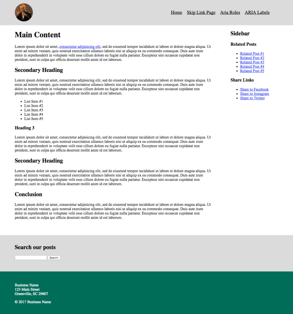
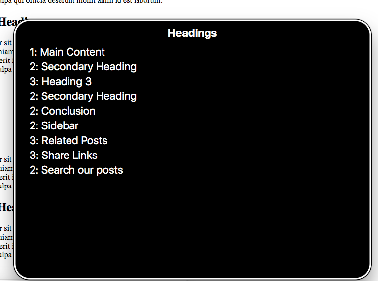
Visually, the content is well divided, using a simple grid and background colors to distinguish the different elements. If you fire up VoiceOver on this page, you can navigate through the page well using the next element command. The order of elements in the markup much follows the visual order of elements. That’s good. If I press CAPS + U to pull up the VoiceOver menus, I can get a list of all the headers on the page and all the links, and navigate directly to them.
Just by using well-structured HTML, simple grouping with <div> elements and a good use of heading tags we’ve got a decent experience. It’s better than the rambling story websites I mentioned above, but it could be even better.
Our first step in enhancing the accessibility of the page is adding a skip-link as the first item of the page.
A skip link is a common accessibility feature that allows users to skip past lengthy lists of links and other information repeated on every web page directly to the main content of the current page.
It’s a link that is the first element in the tab order of the page. It is typically visually hidden, but when focused, it appears on-screen. To visually hide the link, we’ll add the following CSS:
.skip {
    clip: rect(1px, 1px, 1px, 1px);
    position: absolute !important;
    height: 1px;
    width: 1px;
    overflow: hidden;
    word-wrap: normal !important; /* Many screen reader and browser combinations announce broken words as they would appear visually. */
}

/* Display the link on focus. */
.skip:focus {
    background-color: #fff;
    border-radius: 3px;
    box-shadow: 0 0 2px 2px rgba(0, 0, 0, 0.6);
    clip: auto !important;
    color: #888;
    display: block;
    font-weight: bold;
    height: auto;
    left: 5px;
    line-height: normal;
    padding: 15px 23px 14px;
    text-decoration: none;
    top: 5px;
    width: auto;
    z-index: 100000;
}
The link location of the skip link needs to be an id pointing to the main content of the page. In our case, I added id="main" to the <div class="content"> section and gave the skip link a url of href="#main".
If you visit the skip link page and hit your Tab key, the link should display. If you fire up VoiceOver and start navigating through the page, the skip link should be the first thing you come across, and clicking it should trigger VoiceOver to start reading the main content of the page.
With this step, we’ve allowed users to skip straight to the meat of our page, but beyond easily accessing the main content, they still don’t have a good conceptual map of the rest of the page.
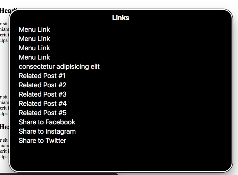
One way to provide users with a conceptual map of the page is by using semantic HTML5 elements like <header>, <nav>, <main>, <section>, and <aside>. These elements have built in data associated with them that is parsed by browsers and screen readers. They create landmarks on a web page. By using these elements judiciously in place of <div> elements, we can provide extra information to assistive technology devices and help the user build a conceptual map of our page.
I’ve maintained the same layout as before, but I’ve swapped some divs for some semantic HTML5 elements. I’ve also added a role attribute to the search component. Alternatively, you could keep all the divs and add a role instead of swapping them out for the new HTML5 elements. (See the w3 guidelines for ARIA roles)
Here are the key changes:
<div class="header"> becomes <header class="header"><div class="main-navigation"> becomes <nav class="main-navigation"><div class="content"> becomes <main class="content"><div class="sidebar"> becomes <aside class="sidebar"><div class="related-posts"> becomes <section class="related-posts"><div class="search"> becomes <div class="search" role="search">Now when I fire up VoiceOver and press CAPS + U, I get a new Landmarks menu. Inside this menu you can see the following elements:
Selecting any of these menu items takes the user straight to that element, so they can easily navigate through the different elements of a page. If they are at the bottom of the page, they can easily get back to the main navigation in the header via the Landmarks menu.
We’ve dramatically increased the navigability of our page and provided an initial map to our users, but we’re missing a few things to make this experience awesome. First, the names of our site sections are generic. We aren’t exactly sure just from listening to the menu what might be in any of the elements. Second, some elements aren’t easily navigable. For instance, our sidebar components are all grouped under the label ‘complementary’.
We can add some well-thought out ARIA labels to make this experience even better.
By peppering in some ARIA labels we can give the user an even more detailed conceptual map of our layout.
In this next iteration, I’ve added the following labels:
<nav class="main-navigation"> now has an aria-label of Primary Navigation.<main class="content"> now has an aria-labelledby attribute of main-title and its <h1> has an id of main-title.<aside class="sidebar"> now has an aria-labelledby attribute of sidebar-title and its <h2> has an id of sidebar-title.<section> elements in the sidebar now have an appropriate ARIA label.Let’s fire up VoiceOver again and pull up our Landmark menu with CAPS+U. Now we see that the ARIA labels we provided display next to each of our generic menu items. We also have a few extra menu items, because the <section> elements we provided labels for (Related Posts, Share Links), now have their own menu items.
Now an assistive technology user can get a quick overview of everything on the site, easily navigate to the section of the page they want, and quickly find what they are looking for.
With a combination of well-structured HTML markup, thoughtful use of ARIA roles and a careful labeling of site sections using ARIA labels, we’re able to create a user experience for assistive technology users that rivals the experience of non-assistive technology users. We were able to take the conceptual map that was implicit in our visual layout and expose it to assistive technology.
You may find holes in your conceptual map or sections that unnecessarily have the same function. The process can help you clarify your designs, identify areas that might not make sense conceptually or visually, and improve your design for all users of your site.
client story, creative design, higher education, higher education website design, web development
digital marketing, digital media, digital strategy for higher ed, higher education, higher education brand strategy, higher education website design, web development